
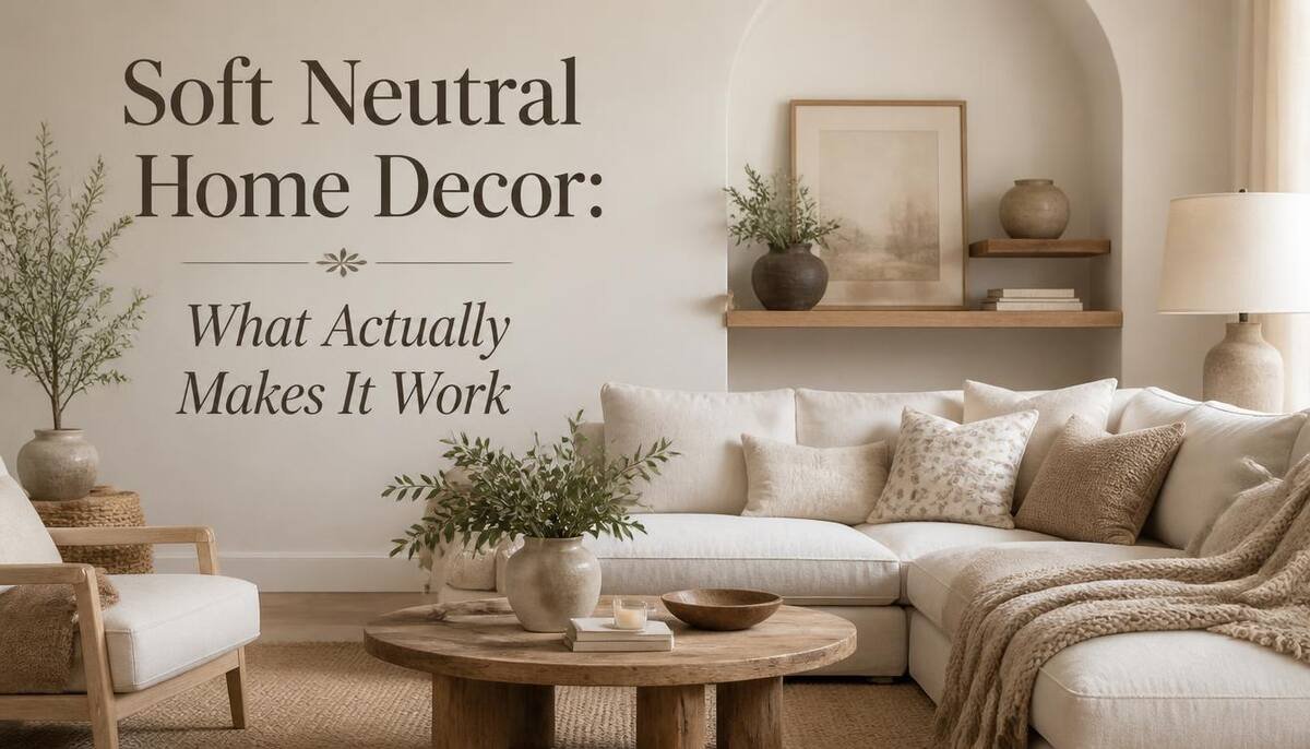
Soft neutral home decor sounds simple until you actually try it and end up with a room that looks flat instead of calm, or worse, a little sad and beige. I made that exact mistake in my own living room a while back, painted everything a safe gray, and ended up with something that felt more like a waiting room than a place I wanted to sit in. It took some trial and error to figure out what separates a genuinely soft, inviting neutral space from one that just reads as empty.
Here’s what I’ve learned actually makes the difference, plus a real shift happening in 2026 that changes which neutrals are worth reaching for right now.
What Makes a Neutral Feel Soft (Not Cold or Sterile)
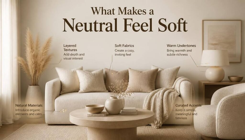
The word “neutral” gets used for everything from a stark white gallery wall to a warm, sunlit beige living room, and those two things feel completely different to sit in. Softness mostly comes down to undertone. A neutral with a warm undertone (yellow, pink, or red hiding underneath) reads as cozy, while one with a cool undertone (blue or green underneath) reads as clinical, even if the two colors look nearly identical on a paint chip.
It’s Not Just Color
Texture does just as much work as the shade itself. A flat-painted white wall next to a smooth leather chair feels sterile in a way the exact same wall next to a linen sofa and a wool rug never does. Soft neutral rooms almost always have texture layered in specifically to counteract how plain the color palette is on its own.
The 2026 Shift: Why Warm Neutrals Are Replacing Cool Grays
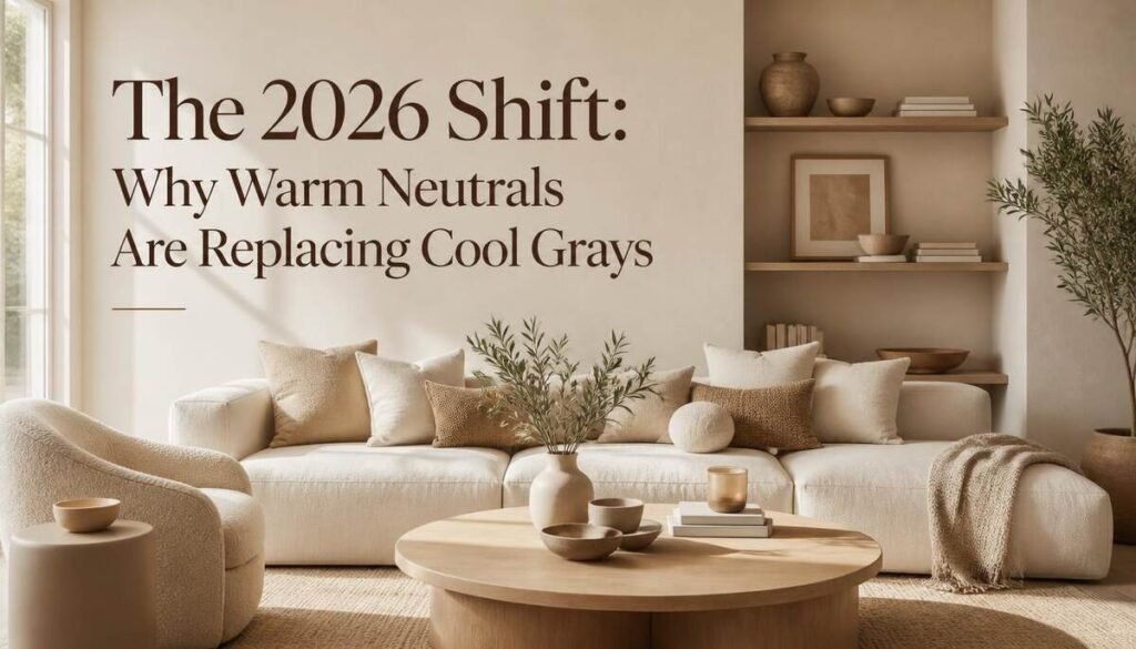
This is genuinely one of the bigger shifts I’ve noticed in neutral decor lately, and it’s not just a personal preference thing, it’s showing up consistently across design coverage this year. Cool grays, the “millennial gray” that dominated for the better part of a decade, are giving way to warmer, earthier tones: caramel, mushroom, clay, cinnamon, coffee.
Part of this seems to be a reaction to how overstimulating a lot of home decor got in the last few years. Design coverage this year has pointed to a move away from dopamine decor, the bold, saturated colors meant to feel energizing, back toward neutrals that actually let a room feel calm rather than busy.
It tracks with something Better Homes & Gardens’ senior home editor said in their 2026 trends report, that the bigger design movement right now is really about returning to the earth, pulling colors straight from natural, muddier hues rather than anything synthetic-feeling.
Building Your Soft Neutral Palette
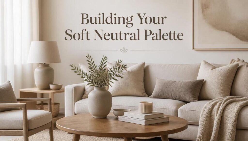
Once you know you’re aiming for warmth over starkness, the actual shade selection gets a lot easier.
The Warm Neutral Lineup
Cream, almond, sand, mushroom, camel, clay, cinnamon, and coffee all fall on the warm side, and any of these work as a base without feeling cold. Terracotta and clay specifically bring in that sun-baked, earthy warmth that’s been showing up everywhere in 2026 design coverage.
Is Green the New Neutral?
This one surprised me a little when I first came across it, but it’s become a genuine talking point among designers this year. Soft sage and mint greens are increasingly being treated as neutrals rather than accent colors, since they’re muted enough to sit in the background the same way beige does, while adding a bit more personality. One interior designer put it well, calling soft green “the new neutral” for exactly that reason, it offers the same livability as a classic neutral with a fresher, more soothing feel.
Beige, Greige, or Gray: Choosing Based on Your Fixed Elements
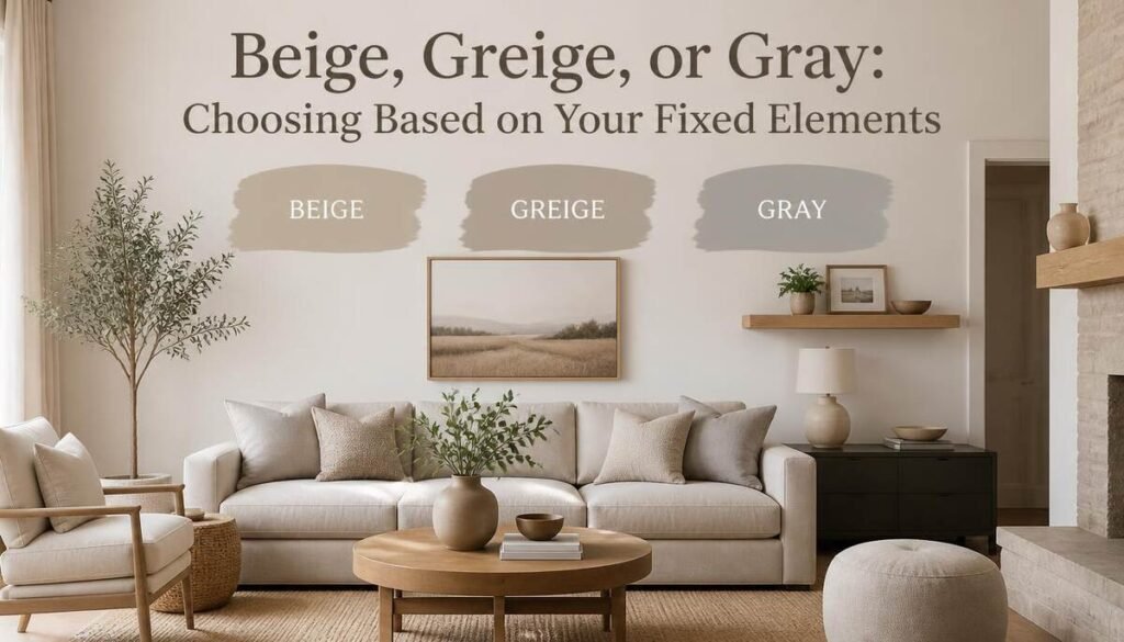
This is a step I skipped the first time around, and it’s probably why my own gray phase didn’t work as well as I’d hoped. The “fixed elements” in a room, your flooring, countertops, or fireplace material, should really be what decides which neutral family you lean into, not just what’s trending.
Beige tends to work best against warm-toned hardwood floors, natural stone, and rooms that already get plenty of natural light. Gray suits cooler-toned flooring and more contemporary, architectural spaces. Greige splits the difference and works as a flexible middle ground if your fixed elements don’t clearly lean one way or the other. Matching the wall color to what’s already permanent in the room saves a lot of trial and error.
The Unexpected Neutral: Why Plaster Pink Is Trending
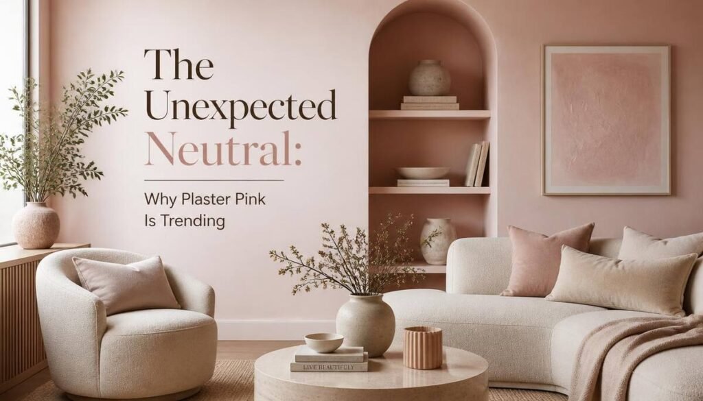
I wouldn’t have called pink a neutral a few years ago, but the palest, most muted versions genuinely function that way now. Plaster pink, an almost-white, delicately pigmented shade, is showing up as a base color the same way beige or cream would, especially in rooms that don’t get much natural light. Farrow & Ball’s brand ambassador has described darker, earthy neutral shades as bringing delicate warmth to a poorly lit space, and the softer pinks do something similar without leaning overtly pink once they’re on the wall.
Soft Neutral Living Room Ideas
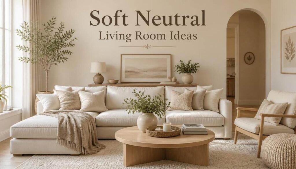
The living room is usually where a soft neutral palette gets tested the most, since it’s the room with the most furniture, texture, and daily use all competing for attention.
Tonal Layering Instead of Strict Matching
Rather than picking one exact shade and repeating it everywhere, layering several tones within the same warm family, a cream sofa, a slightly darker linen throw, a camel leather ottoman, tends to look more collected and less like a matched showroom set.
Anchor With One Statement Textile
A single textured or patterned piece, an oversized woven throw, a chunky knit pillow, a jute rug, gives the eye somewhere to land without breaking the calm the rest of the palette is creating.
Soft Neutral Bedroom Decor
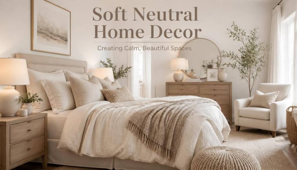
Bedrooms benefit from soft neutrals more than almost any other room, since the whole point is a space that helps you wind down rather than one that stimulates you.
Keep the Palette Even Quieter Here
I’d go a shade or two softer than you would in a living room, layered cream and oatmeal bedding, a warm wood nightstand, minimal pattern. The bedroom is one place where “boring” is actually the goal.
The Five Materials That Make Neutrals Feel Soft
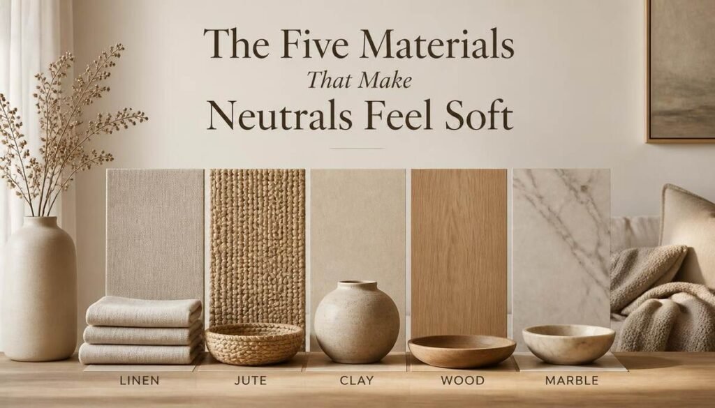
Color gets most of the credit, but material is doing a lot of the actual work in a room that reads as soft rather than stark.
Linen, Wood, Stone, Leather, and Woven Fiber
Linen brings softness and a bit of organic texture. Wood adds warmth and visible grain. Leather or suede brings richness and develops character over time. Stone or marble adds a cool, weighty contrast that keeps an all-soft room from feeling flat. Woven natural fiber, jute, rattan, seagrass, rounds out the mix with texture that reads as handmade rather than manufactured.
Layered, Ambient Lighting for a Softer Feel
I underestimated this one for a long time. A perfectly chosen warm neutral palette can still look cold under the wrong lighting.
Skip the Single Overhead Light
Layering in a table lamp, a floor lamp, and dimmable ceiling lighting does more for the “soft” feeling than almost any paint color choice. Lampshades in natural fiber or warm-toned glass echo the same earthy warmth as the rest of the palette instead of fighting against it with cold, bright light.
Neutral Home Decor Accessories
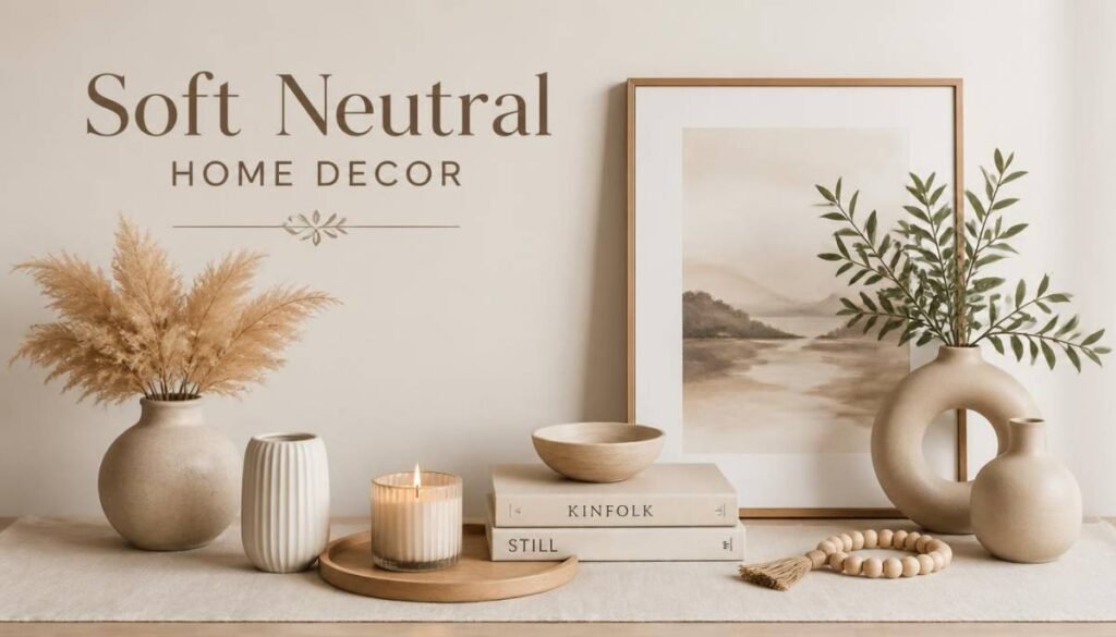
The accessories are where a soft neutral room actually gets its personality, since the walls and big furniture pieces are intentionally staying quiet.
Small Pieces, Real Texture
A clay vase, a woven basket, a stack of linen-bound books, a stone bowl, these small, tactile objects do more for warmth than any single large purchase. They’re also the easiest, cheapest way to shift a room’s feel without repainting or replacing furniture.
Edit More Than You Add
This might be the single most useful thing I’ve picked up doing this myself: a soft neutral room almost always looks better with fewer, better pieces than with more of them. It’s tempting to keep adding texture and accessories once you’re into the aesthetic, but the calm, restful feeling the whole style is built around disappears fast once a surface gets crowded. When in doubt, remove something rather than add something else.
Quick Reference: Warm vs. Cool Neutral Shades
| Warm Neutrals | Cool Neutrals |
| Cream, almond, sand | Soft white, ice gray |
| Mushroom, camel, clay | Oyster, dove gray |
| Cinnamon, coffee, terracotta | Pebble, steel, pewter |
| Plaster pink, sage green | Slate gray, charcoal |
Mistakes Worth Avoiding
A few things trip people up more than others when trying this for the first time.
Going too cool without meaning to is probably the most common one, a “neutral” chosen without checking its undertone can end up reading as clinical rather than calm. Skipping texture is another, a room painted in a perfect warm neutral still falls flat if every surface is smooth and flat. And overcrowding accessories undoes the whole point, more small objects doesn’t equal more warmth past a certain point, it just starts to look cluttered.
FAQ Section
What are good soft neutral home decor ideas for a living room?
Layering warm tones within the same family (cream, camel, oatmeal) rather than matching one exact shade, plus one statement textural piece, gives a living room warmth without losing the calm neutral feel.
What is trending in neutral home decor for 2026?
Warmer, earthier neutrals like caramel, mushroom, and clay are replacing cool grays, and some designers are now treating soft sage and mint green as neutrals too.
Is modern neutral home decor different from soft neutral decor?
Modern neutral decor tends to lean cooler and more architectural (grays, whites, sharp lines), while soft neutral decor leans warmer and prioritizes texture and coziness over a crisp, minimal look.
What accessories work best in a neutral home?
Tactile, natural-material pieces, a clay vase, a woven basket, linen-bound books, add warmth and personality without introducing bold color into an otherwise quiet palette.
How do I make neutral decor feel warm instead of cold?
Check the undertone of your chosen shades (warm over cool), layer in natural materials like linen and wood, and use ambient, layered lighting instead of a single overhead source.

Hi, I’m Liam Alexander! As a home décor specialist for dailyhomevibe.com, I’m super passionate about bringing elegance and simplicity into modern living spaces. I love sharing smart design solutions, helping you optimize your space, and highlighting timeless trends to inspire you to create a home you truly love coming back to.